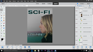
I firstly chose my background image of 'Broken Hill' I changed the brightness of the image to make it look more ominous and gloomy.
I cropped around the side profile of Lilie and deleted the inverse to leave the main image. I filled the image in a solid black to look like a silhouette and place it on to the background image.
I decided that this technique did not follow the conventions of my genre and did not create the connection between the character and the location she is stood before. I deleted the solid colour and changed the opacity of Lilie's side profile.
The image created an unbalance between the mystery genre and the sci-fi, this is when I decided to change the hue saturation and colour of the image, this followed the conventions and colour scheme of the cross genre that I am following.
Here I began to experiment with the masthead name and font style, I wanted to make the font follow the cross genre, however the masthead and font looked out of place on the page.
I changed the title of the magazine and used a different font style. I added an inner glow to follow my house style as I used the same feature in the Lexicon trailer captions and text on the poster.
I integrated the word 'TOTAL' in to the masthead to create the name 'TOTAL SCI-FI'. I use the same font and effect on this section of the masthead.
I began to involve the identity of the film in to the magazine by copying the text from the poster and trailer, again following the conventions, house style and intertextuality.
I added the tagline and the plug above and below the title of the film, this framed the title and made it stand out on the page.
I positioned this text to line up against the landscape and underline the buildings in the distance.
I added the puff at the top of the page to sell my magazine to my demographic, and then added an outer glow to the text.
I began to work on my cover lines down the side of the page in a form of a column, each cover line is separated by a glowing line.
I chose cover lines to specifically follow my genre and use recent films and television programs.
I experimented with the colours of the text of the cover lines, I decided that the use of blue would be too extensive and did not stand out on the page from a distance.
I used a mix of blue, white and black on the page to tie in the colour scheme and house style of my three products.
I changed the sizes of the cover lines on the side and also changed how my magazine puff looked.
After the research of existing magazines I noticed that EMPIRE included the date and price within the masthead so that it did not distract the reader from the contents of the magazine.

In order to balance the text from the top to the bottom of the page I inserted block shapes at the bottom to create space for the contents and plug.
I used an inner and outer glow on the circular shape in the corner of the page, this made it more noticeable, I then added the text and turned it on a slant.

 I changed the colour of the puff text and made the square text box slightly opaque as it was too dark at the bottom of the page and covered too much of the feature article photo. Then I added contents, making some bold to show the importance, I used this idea from referring to an existing magazine I had analyzed.
Lastly I ensured there was a bar code and price in the bottom right hang corner of the page, this followed the convention of the media product.


No comments:
Post a Comment