Monday, 12 October 2015

Final Storyboard


For the introduction of I have chosen to use a flashback of the Broken Hill disaster, the first few scenes will include Louise Herbert and multiple extras to play dead, the scenes are about the 'disease' in the town, Louise is an 'immune' inspector walking around a school to find out anything that will give us knowledge of what happened. The next couple of scenes will be a small cut of dialogue about the plot of the film and will be linked using a sound bridge. 


The next few shots will be explaining Wil's kidnapping and his encounter with Rain.  I will get some POV shots along with reaction shots of Wil after particular events happen within the scene.  I will be using eery sound effects and dialogue in these scenes.


In the next parts of the trailer there will be fast shots of the characters encounter with rain, this is where the 'Short Man' (Ewan) is shot.  There will be another reaction shot of Wil following this.  After this clip I will return to Scene 2 where Tom Eliot and Wil are sitting in a cafĂ©, this is another scene where the plot of the film will be revealed.
These next scenes will be a part of a flashback of how Tom Eliot met Emily/Woolf.  It will begin with an OSS which will turn in to a POV and pan up towards Tom's face.  There will be a voice over up to this moment, the scene will have a transition to McDonalds where Tom Eliot will begin a questionnaire and offer Emily a job.  We will return to Scene 2 where Tom will explain the complications of Emily as a student, there will be short clips of Emily's wrong doings, a soundbridge will stretch across these scenes.

The soundbridge of Tom's dialogue will continue as a bridging shot is used to explain the transfer from the UK to Broken Hill, Australia.  I'll then use a matte shot to introduce the Broken hill disaster word.  Other short clips will follow of more of Emily's and Tom's past.  tis will then quickly transfer back to Scene 2 as the pace begins to build again as Emily/Woolf makes an appearance in present time as she is hunting down Tom and Wil.  This will be shown using a close up of her feet, which will then pan to her face.


At the end I will have a tracking shot of Tom and Wil running from their previous location during Scene 2.  This will dramatically cut to the last scene as Wil says that he cannot remember anything, the screen will fade to black to conclude the trailer.

Wednesday, 30 September 2015

Draft Storyboard


Whilst making my first storyboard I became aware that I was focusing on being true to the chronological order of the book, instead I should've been focusing on the conventions of the media.  I then changed my storyboard to follow these conventions; introduction, build up, climax (without conclusion) and finale.

Wednesday, 23 September 2015

Camera Workshop

Whilst doing the camera workshop we gained knowledge of how to use the cameras, using different techniques and different shooting methods in order to create stylistic and effective angles in order to make our trailer more professional. 
There are different pieces of equipment that we practiced with so that we used them properly in order to make our filming techniques better. These included the camera, the tripod, and the dolly to move with the tripod and camera in a smooth, steady motion.

Principle Photography:
- I must follow the shot list and the storyboard whilst filming as this will help with continuity and consistency, as well as having a plan of what to shoot. 
- Whilst filming I must have a few seconds before and after the scene, this will help me when I am editing my trailer.
- It is best to do some blocking in the locations that I am filming in, this will allow me to find the best position for the camera and the actor.
- I must shoot each scene around three times, by doing this I will have a variety of shots and the ability to decide which shoot is best to use in my trailer, this will also help me when editing for continuity.

Camera position/ movement:
- It is best to decide before shooting, how you would like the footage to come out, whether it be steady or shaky, this depends on the use of a tripod.
- Certain camera angles will provoke a different reaction and meaning of the shot, such as a high angle is used to show dominance. 
- Some camera angles look best when following, or followed by a different camera angle.  the use of pairs compliment the scene, such as a close up and eye line match.

Framing:
- The rule of thirds is a very important framing method as it will connote different meanings, for example, a main character will be in the center of the frame to show their importance in the scene.
- I must also remember that headroom and moving space must be given to the character in order to make a better shot.

Distances:
- Remember to use the correct focus and zoom on the camera.
- The use of the depth of field is just as important as the rule of thirds, the proxemics can change the mood of the scene.

Lighting:
- Use the light effectively for what you are wanting to shoot. 
- Flat light will reduce the quality of your footage, this happens due to poor weather conditions. 
- Lighting can effect the continuity of the trailer, it is easy to pick up on and must be avoided.

Friday, 18 September 2015

Tron Legacy Magazine Cover Analysis


The masthead is written with a backing glow, the same as the headline for the feature article, the typography is not the same however the appearance of the text has been edited to partner the stylistic TRON design.  The feature article photo overlaps the masthead, however it is still legible, this shows that the contents of the magazine are more important than its status and image, this is reflected in the plug 'the modern guide to movie's, the selling point of the magazine is purposely for the films and the viewers, not the magazine's popularity.

The feature article photo is taken from a slightly low angle to connotes power and dominance, the main subject is standing square on to the camera, his chin slightly held upwards and giving direct eye contact, his hands are also wrapped around the O disc, portraying his power over the 'game', for the viewer this makes them feel slightly inferior to the character as his mannerisms express him to be wise and confrontational, this is enhanced by the fact that he is an older male and standing in front of two younger characters.  The young male is standing with his left side more towards the front and has his head downwards to his left with his eyes lifted for direct contact the the viewer, the female is turned away from the camera whilst having her head turned towards us, again with direct eye contact; the overall sense of this image is the seriousness of the 'game' and the control they have over their fears.
They subjects are all wearing black futuristic attire, each of them having some relation with the glowing discs, if the readers do not know of the film TRON then they would be intrigued as to what it is about from the connotations of the feature article photo.

The cover lines of the magazine are written in a separate text box at the bottom of the page, some are written in a bold white font, others are written in a thin white font, this is used to differentiate between the articles and their importance in the magazine, the puff 'PLUS' leads on to the cover lines and is written in a metallic block capital font.
An additional set of cover lines are listed on the right hand side, a + symbol is used at the top of the list as an indicator, the metallic effect is used again on the text boxes for the cover lines, therefore creating the magazine's house style, bold and normal black font is used for the text, giving a contrast between the colours.

The headline of the feature article is integrated with the image, with the disc acting as the O in TRON, the text is written with a back glow and detailing in the letters to enhance the shapes and precise lines, the letters are stencil-like as they are not completely separate from each other, this connotes the structure of the 'game', how there is a balance and if it became unbalanced then structure would fall apart.  Again, the depth of this front cover will attract many consumers.

'thrill' and 'skill is a short and snappy mode of address for the audience as they are not having to read a large amount and can get straight to the point of the puffs used to grab the attention of readers.

The plug 'taking 3D to the next level' attracts readers as the experience of a film is loved by a majority of film fanatics, the idea that the 3D is enhanced and taken advantage of in this film is even more appealing, therefore gaining a large demographic.

Wednesday, 16 September 2015

Maze Runner Magazine Cover Analysis


The masthead is written in a custom font where no two letters are the same, the first M has a curve and is filled in black with a white outline whereas the Y and M are semi-transparent red with a white outline, the Y is smaller and cuts off parts of each M, and the last M has a sharp corner; each aspect of the masthead is individual and would appeal to a younger demographic because of its quirky appearance.

A candid image is used for the feature article photo, it is a still of the action within the film, all of the characters are running, this conveys a chaotic scene and the desperation of the subjects. With the image being candid it makes the story if the film more mysterious as we are not told what we want to know. The image is taken from a high angle, we see the characters running up a hill, with a maze like structure behind them, the white glow behind the characters is used to represent the unknown dangers within the maze. Their is a large sense of omnipotence in the image as it is taken from a high angle and that the young adult characters are running from a predator, when the human race is supposedly at the top of the food chain.

Cover lines are written on the left and right of the page, introduced with a sharp red shape and bold white writing, the red and white colour scheme works well with the dark and gloomy background image.  Other cover lines can be found at the bottom of the page following from the large red puff 'PLUS', the text is fairly small and tightly packed against on another, commas are used to separate each cover line.

The headline of the feature article is written in a stone effect font, with sharp bold lettering, this is down to replicate the stone walls of the maze seen in the background of the image. It is written very simply, with a word on each line, each word is bigger or longer and has the same letter spacing.  This is done again to replicate the maze, the differences of the walls and spacing, along with how they change.

The puff '25 games covered inside!' takes up fairly large amount of space on the page, it relates to the puff at the top of the page about 'movies anime manga games & more', the magazine is purposely directed to a younger demographic as its contents are focused on the fun, young activities.  The magazine also has a relation with comic con, this would appeal to a large demographic as the comic con convention holds exhibits from thousands of games, moving pictures and books for all ages.

There is a plug below the headline, it is written in a simple white text, the sentence is just as simple when it is describing the article's content.  The mode of address is very informal and more jokey and chatty, showing that it is aimed at a slightly younger demographic, such as those in their teens.

Monday, 14 September 2015

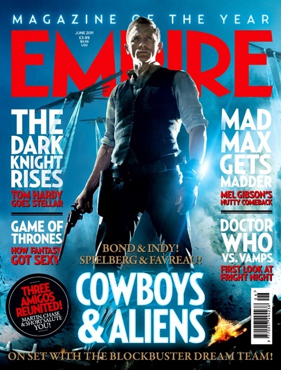
Cowboys & Aliens Magazine Cover Analysis


The masthead of the magazine is written in a bold red font, this contrasts with the blue background, the image of Daniel Craig and the alien ships overlap the masthead as the importance of the magazine is not as much as that of the advertisement for Cowboys & Aliens, the magazine very well known so it can sacrifice the full few of the masthead.

The feature article photo is taken from a low angle to make the character seem powerful, dominant and hero like against the alien ships in the background of the image, the flaming hat in the bottom right hand corner also reflects this powerful and relative mood.  There is a bright electric blue behind the subject of the image, this is the same colour of the beams coming from the ship, this is a conventional colour of sci-fi films.  The clouded background connotes the mystery element of the film.

The cover lines are written in two colours with two sections, in white block capitals are the names of the film or program as it has more of a contrast with the background colour and will be the first thing that readers will look at when reading the cover lines as the importance depends on the relevance it has to the reader, the red text is a smaller size font but still in block capitals, this is the brief description of what the article is about so that the reader has an idea of what they will be reading and whether it would interest them.  The layout of the cover lines helps to separate the film articles from the TV program articles, giving the reader a clear and easy way to navigate through the magazine and front cover.

The same electric blue light is used for the headline of Cowboys & Aliens, this ties in the colour scheme of the image and reinforces the conventions of the sci-fi genre.  The size of the font and the simplistic style makes it bold on the page as it is quite large and in the center underneath the main subject of the feature article photo.

The puff  'magazine of the year' is written at the top of the page on a glowing blue colour to stand out from its dark blue background, it is important for the magazine to display its status using puffs so that they gain more consumers as they are able to trust the knowledge and information within the articles, the text is not too bold on the page so is fairly modest in comparison to the cover lines and feature article photo.

The plug 'three amigos reunited' is written in the red block capital font on a circular black shape, the contrast stands out and is an additional factor for the magazine's house style, it is used to catch the readers attention so that it appeals to a certain niche of their demographic, in this case people who know the names of the actors and enjoy the films that they act in. The 'Bond & Indy...' text written above and below the main cover line gives a brief description of who is in the film and who directed the film in four words, the sentence at the bottom of the page is about the article and what the crew have been involved in with the filming of Cowboys & Aliens. This text is also written in a gold serif font, this makes it seem more important on the page as it is different from the other text on the page.

Thursday, 10 September 2015

Minority Report Poster Analysis

1.                2.

Purpose: The purpose of poster 1 is to layout different events that happen in the film so that the audience will attempt to piece them together, however poster 2 only shows Cruise' face and eye, this reveals less about the film and conveys more of a mysterious story behind the character.  Both posters also have a secondary purpose to advertise the main actor and boast about the famous Steven Spielberg's influence on the film.

Colours: Poster 1 mainly uses a pallet of blues from dark blue to electric blue, this is the conventional colour of a sci-fi film. Poster 2 used very dark foreboding colours and a small pallet of browns for the eye area of the poster.

Key image: On poster 1 there are various images key to the story, most of which look as though they are thoughts in Cruisw's head, the other is a semi-transparent image of an officer's badge. Poster 2's key image is the highlighted brown eye, when you look closely the triangular shaped 'system' is shown as a reflection in the eye, this is only a small piece of information given to the audience in this poster, the eye reflects the idea of 'seeing is believing' as well as eyes being a 'passage to the soul', not only this but eyes are used as identification.

Background: Poster 1's background is made up of the semi-transparent officer's badge and a stone wall behind, both of which are slightly blue.  The connotations of these are that Cruise's character has a relation with the police force, the stone wall could represent captivity and the unknown.  The background on poster 2 is very minimalistic, this is because the main purpose of the poster is to look into the eye and look at the overall face, Cruise' character has a bandage round his eye, this represents hiding and secrets.

Realism: Poster 1 uses realistic images in a collection, these images overlap Cruise' face, this is done via computer editing, the images are photographed from real events in the film, however the events are futuristic and are unrealistic in present time.  Poster 2 is the most realistic as the image is not science fictional, the only edited part is the eye and the pattern that blends in with the bandage.

Text: On both posters the text is white, this is to contrast with the darker background.  The font used adds serifs to the ends of the letters, this gives the text a pristine look on the chaotic and mysterious posters.

Tagline: The tagine 'everybody runs' has a chilling reaction on the reader, and raises questions about what people are running from, or to.

Layout: The first poster is more chaotic with overlapping images, whereas the second is simplistic yet effective.  Both posters have similar layouts with Tom Cruise' name at the top, the main image in the center, Spielberg's name written above the title with more information about the making of the film written in the bottom section of the poster.  This layout makes it easier for the views to read the information whilst still reacting to the images.

Target audience: The target audience is mainly aimed towards adults as there is a seriousness about the poster, and the Tom Cruise acts in more adult films.  However as the genre of the film incorporates mystery, sci-fi and thriller, younger and older generations that enjoy the genres will enjoy the film to.