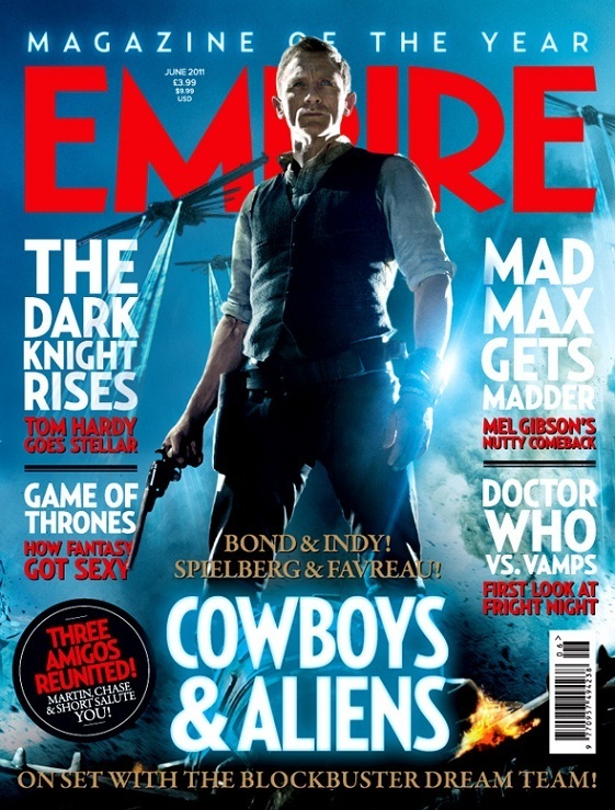
The masthead of the magazine is written in a bold red font, this contrasts with the blue background, the image of Daniel Craig and the alien ships overlap the masthead as the importance of the magazine is not as much as that of the advertisement for Cowboys & Aliens, the magazine very well known so it can sacrifice the full few of the masthead.
The feature article photo is taken from a low angle to make the character seem powerful, dominant and hero like against the alien ships in the background of the image, the flaming hat in the bottom right hand corner also reflects this powerful and relative mood. There is a bright electric blue behind the subject of the image, this is the same colour of the beams coming from the ship, this is a conventional colour of sci-fi films. The clouded background connotes the mystery element of the film.
The cover lines are written in two colours with two sections, in white block capitals are the names of the film or program as it has more of a contrast with the background colour and will be the first thing that readers will look at when reading the cover lines as the importance depends on the relevance it has to the reader, the red text is a smaller size font but still in block capitals, this is the brief description of what the article is about so that the reader has an idea of what they will be reading and whether it would interest them. The layout of the cover lines helps to separate the film articles from the TV program articles, giving the reader a clear and easy way to navigate through the magazine and front cover.
The same electric blue light is used for the headline of Cowboys & Aliens, this ties in the colour scheme of the image and reinforces the conventions of the sci-fi genre. The size of the font and the simplistic style makes it bold on the page as it is quite large and in the center underneath the main subject of the feature article photo.
The puff 'magazine of the year' is written at the top of the page on a glowing blue colour to stand out from its dark blue background, it is important for the magazine to display its status using puffs so that they gain more consumers as they are able to trust the knowledge and information within the articles, the text is not too bold on the page so is fairly modest in comparison to the cover lines and feature article photo.
The plug 'three amigos reunited' is written in the red block capital font on a circular black shape, the contrast stands out and is an additional factor for the magazine's house style, it is used to catch the readers attention so that it appeals to a certain niche of their demographic, in this case people who know the names of the actors and enjoy the films that they act in. The 'Bond & Indy...' text written above and below the main cover line gives a brief description of who is in the film and who directed the film in four words, the sentence at the bottom of the page is about the article and what the crew have been involved in with the filming of Cowboys & Aliens. This text is also written in a gold serif font, this makes it seem more important on the page as it is different from the other text on the page.
No comments:
Post a Comment